Finding the MoreyBall Regions
MoreyBall is known as the style of play where the majority of the shots are taken either from under the basket or from 3.
I'm going to plot the statistically effetive shot distances
import pandas as pd
import numpy as np
import requests
import matplotlib.pyplot as plt
from nba_api.stats.endpoints import shotchartdetail

%matplotlib inline
I installed an package called nba_api (https://github.com/swar/nba_api) in order to get the data from the NBA api. I'm defining one function which will help me loop through a few seasons.
def seasons_string(start_year,end_year):
    '''
    creates a list of NBA seasons from start-end
    '''
    years = np.arange(start_year,end_year)
    seasons = []
    for year in years:
        string1 = str(year)
        string2 = str(year+1)
        season = '{}-{}'.format(string1,string2[-2:])
        seasons.append(season)
    return seasons
Define plotting parameters:
plt.style.use('classic')

def nice_plot(xlabel='',ylabel='',title='',subtitle='',
              name = 'By: DoingTheDishes',source = 'NBA.COM',
              figsize=(1.33*8,8),bg_color='white'):

    fig = plt.figure(figsize=figsize)

    fig.set_facecolor(bg_color)

    # create labels and title for figure
    fig.text(0.01,0.01,name,fontsize=14.0,color='gray',
             horizontalalignment='left',verticalalignment='bottom')
    fig.text(0.99,0.01,'Source: '+source,fontsize=14.0,color='gray',
             horizontalalignment='right',verticalalignment='bottom')

    fig.text(0.01,0.99,title,fontsize=22.0,
            horizontalalignment='left',weight="bold",verticalalignment='top')

    fig.text(0.01,0.93,subtitle,transform=fig.transFigure,fontsize=16.0,
            horizontalalignment='left',verticalalignment='top')

    fig.text(0.53,0.048,xlabel,fontsize=16.0,color='black',
                   horizontalalignment='center',verticalalignment='center')

    fig.text(0.03,0.495,ylabel,fontsize=16.0,color='black',
                   horizontalalignment='center',verticalalignment='center',rotation=90)

    ax_left = 0.1
    ax_bottom = 0.12
    ax_width = 0.85
    ax_height = 0.73

    ax = fig.add_axes([ax_left,ax_bottom,ax_width,ax_height])
    ax.set_facecolor(bg_color)
    ax.grid('on', linestyle='--',color='gray')
    ax.spines['top'].set_visible(False)
    ax.spines['right'].set_visible(False)
    ax.axes.tick_params(length=0)
    ax.tick_params(labelsize=16)

    return fig,ax

colors = ['#008fd5', '#fc4f30', '#e5ae38', '#6d904f', '#8b8b8b', '#810f7c']
Get the data:
The function shotchartdetail.ShotChartDetail will make an API call in order to get the shot data. Here are a few pointers to use it since I struggled a bit at first:
- The shotchart detail accepts 0 for team and player meaning all of them. Those are input parameters that you must included with the class call.
- The season_nullable parameter let's us choose the season. I will us it to loop through the seasons (from 2014-15 to 2018-19) and collect all of the shot data from those seasons
- I set the context_measure_simple to FGM otherwise the API call only gets the made shots.
- The default timeout is 30 seconds which might not be enough to get the entire data from the API so I increased it to 60 seconds.
- Calling ShotChartDetail will return all of the data associated with that call. In this case it includes the detailed shot by shot data and the leage averages. In order to get the shot by shot data I will use get_data_frames()[0]
data = []
for season in seasons_string(2014,2019):
    shotdata = shotchartdetail.ShotChartDetail(team_id='0',player_id='0',season_nullable=season,
                                               context_measure_simple='FGM',timeout=60)
    single_season = shotdata.get_data_frames()[0]
    single_season['SEASON'] = season
    data.append(single_season)
    print(season)

data = pd.concat(data,ignore_index=True)
We can run a quick test to see how many shots we captured for each season
data['SEASON'].value_counts()
We can see the the number of shots has increased steadily over the last 5 seasons. This is probably due to th fact that the pace of the game keeps increasing
Data Analysis:
We can preview the data
data.head().T
I'm going to do the following:
- The shot distance seems to be rounded down so I'm going to calculate the distance from the loc_x and loc_y columns which are the x and y coordinates in feet*10.
- Map the shot type to a number. This indicates whether it was a 2 or 3 point shot.
- Calculate points per shot (a miss is 0 points)
data['own_SHOT_DISTANCE'] = (1.0/10)*np.sqrt(data['LOC_X']**2+data['LOC_Y']**2)
data['SHOT_TYPE_NUMERIC'] = data['SHOT_TYPE'].map({'2PT Field Goal':2,'3PT Field Goal':3})
data['POINTS'] = data['SHOT_TYPE_NUMERIC']*data['SHOT_MADE_FLAG']
# define bin size and create shot distance buckets
bins = np.arange(0,35,0.5)
data['DISTANCE_BUCKET'] = pd.cut(data['own_SHOT_DISTANCE'],bins)
let's preview the data again
data.head().T
Now the column DISTANCE_BUCKET has a distance range. We can use it to group by and get the numbers we are interested in. We also created the POINTS column which indicates the points per shot (either 0 for a miss, 2 for a 2-point field goal made or 3 for a 3-point field goal made). We can use the SHOT_MADE_FLAG to tell whether the shot was in or not.
# Calculate the points per shot for each distance
shot_efficiency = data.groupby('DISTANCE_BUCKET')[['POINTS','SHOT_MADE_FLAG']].mean()
shot_efficiency.columns = ['points_per_shot','fg_pct']
That's it! For each DISTANCE_BUCKET we calculated the mean point_per_shot and the field goal %.
shot_efficiency
Plotting:
# figure definitions
figsize=(12,8)
xlabel='Shot Distance (feet)'
ylabel='Field Goal (%)'
title='What is MoreyBall All About?'
subtitle='Finding the most statistically efficient shot distances'
bg_color=(0.97,0.97,0.97)
name = 'By: DoingTheDishes'
source = 'NBA.COM'

fig = plt.figure(figsize=figsize)

fig.set_facecolor(bg_color)

# create labels and title for figure
fig.text(0.01,0.01,name,fontsize=14.0,color='gray',
         horizontalalignment='left',verticalalignment='bottom')
fig.text(0.99,0.01,'Source: '+source,fontsize=14.0,color='gray',
         horizontalalignment='right',verticalalignment='bottom')

fig.text(0.01,0.99,title,fontsize=24.0,
        horizontalalignment='left',weight="bold",verticalalignment='top')

fig.text(0.01,0.94,subtitle,transform=fig.transFigure,fontsize=18.0,
        horizontalalignment='left',verticalalignment='top')

fig.text(0.53,0.048,xlabel,fontsize=16.0,color='black',
               horizontalalignment='center',verticalalignment='center')

fig.text(0.03,0.495,ylabel,fontsize=16.0,color='black',
               horizontalalignment='center',verticalalignment='center',rotation=90)

ax_left = 0.08
ax_bottom = 0.12
ax_width = 0.85
ax_height = 0.75

ax = fig.add_axes([ax_left,ax_bottom,ax_width,ax_height])
ax.set_facecolor(bg_color)
ax.grid('on', linestyle='--',color='gray')
ax.spines['top'].set_visible(False)
ax.spines['right'].set_visible(False)
ax.axes.tick_params(length=0)
ax.tick_params(labelsize=16)

colors = ['#008fd5', '#fc4f30', '#e5ae38', '#6d904f', '#8b8b8b', '#810f7c']

x = 0.5*(bins[:-1]+bins[1:]) # get the average bin distance

# do the actual plotting
ax.plot(x,100*shot_efficiency['points_per_shot']/2,'o',color=colors[0],label='Effective FG %')
ax.plot(x,100*shot_efficiency['fg_pct'],'--k',label='FG %')

ax.set_xlim([-0.5,35])

# plot the emphasis regions
ax.fill_between([0,0,2.4,2.4],[10,90,90,10],color=colors[1],alpha=0.15)
ax.fill_between([22.5,22.5,28,28],[10,90,90,10],color=colors[1],alpha=0.15)

# plot the corner 3 and 3-point distances
ax.vlines(22,ymin=0,ymax=90,color='k',alpha=0.5,linewidth=2)
ax.text(19,19.5,'Corner 3',verticalalignment='top')

ax.vlines(23.75,ymin=0,ymax=90,color='k',alpha=0.5,linewidth=2)
ax.text(24,19.5,'3-Point\nline',verticalalignment='top')

# plot the arrows
ax.annotate('"Good" Shots', xy=(2.5, 65), xytext=(7, 74),color=colors[1],
            alpha=0.25,fontsize=20,weight='bold',zorder=10,backgroundcolor=(0.97,0.97,0.97),
            arrowprops=dict(facecolor=colors[1], shrink=0.05,alpha=0.15),
            )

ax.annotate('"Good" Shots', xy=(22, 65), xytext=(7, 74),color=colors[1],
            alpha=0.0,fontsize=20,weight='bold',zorder=10,
            arrowprops=dict(facecolor=colors[1], shrink=0.05,alpha=0.15),
            )


ax.legend(loc=(0.1,0.11),scatterpoints =1,facecolor = (0.97,0.97,0.97),edgecolor ='none')

And finally save the figure
fig.savefig('EFG vs shot distance.png',bbox_inches='tight',facecolor=fig.get_facecolor(), edgecolor='none')
Conclusions:
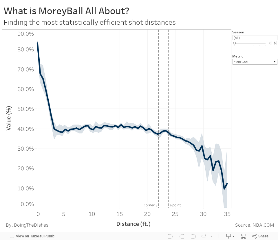
- The efficient regions are below 2.5 feet and 3's up to 28 feet away
- The FG % barely changes from about 4 feet all the way to the 3 point line
Extra Analysis
Now let's say we wanted to find those same parameters pre season to see how they change, we only need to add the season into the group by.
# Calculate the points per shot for each distance
shot_efficiency_per_season = data.groupby(['DISTANCE_BUCKET','SEASON'])[['POINTS','SHOT_MADE_FLAG']].mean()
shot_efficiency_per_season.columns = ['points_per_shot','fg_pct']
shot_efficiency_per_season['efg_pct'] = 0.5*shot_efficiency_per_season['points_per_shot']
shot_efficiency_per_season = shot_efficiency_per_season.reset_index()
shot_efficiency_per_season['DISTANCE'] = [(a.left+a.right)/2 for a in shot_efficiency_per_season['DISTANCE_BUCKET']]
shot_efficiency_per_season.head()
Interactive Plot
Tableau as an option to upload the figure to Tableau Public. The figure can be shared by either providing a link or embedding it in your website. I will embed the plot to this notebook.
I'm going to save the raw data into a csv file and plot the rest in Tableau to create an interactive plot.
shot_efficiency_per_season.to_csv('shot_efficiency_by_distance.csv',index=False)
%%html
<div class='tableauPlaceholder' id='viz1574369646955' style='position: relative'><noscript><a href='#'><img alt=' ' src='https://public.tableau.com/static/images/Fi/FieldGoalByShotDistance/Dashboard1/1_rss.png' style='border: none' /></a></noscript><object class='tableauViz' style='display:none;'><param name='host_url' value='https%3A%2F%2Fpublic.tableau.com%2F' /> <param name='embed_code_version' value='3' /> <param name='site_root' value='' /><param name='name' value='FieldGoalByShotDistance/Dashboard1' /><param name='tabs' value='no' /><param name='toolbar' value='yes' /><param name='static_image' value='https://public.tableau.com/static/images/Fi/FieldGoalByShotDistance/Dashboard1/1.png' /> <param name='animate_transition' value='yes' /><param name='display_static_image' value='yes' /><param name='display_spinner' value='yes' /><param name='display_overlay' value='yes' /><param name='display_count' value='yes' /><param name='filter' value='publish=yes' /></object></div> <script type='text/javascript'> var divElement = document.getElementById('viz1574369646955'); var vizElement = divElement.getElementsByTagName('object')[0]; if ( divElement.offsetWidth > 800 ) { vizElement.style.width='960px';vizElement.style.height='827px';} else if ( divElement.offsetWidth > 500 ) { vizElement.style.width='960px';vizElement.style.height='827px';} else { vizElement.style.width='960px';vizElement.style.height='827px';} var scriptElement = document.createElement('script'); scriptElement.src = 'https://public.tableau.com/javascripts/api/viz_v1.js'; vizElement.parentNode.insertBefore(scriptElement, vizElement); </script>
Comments
comments powered by Disqus